Thursday 26 September 2013

Double Page Spread Construction


I started with a blank white document on Photoshop and added the page numbers to the bottom to give the effect that this is a real media product.


I then added the main image to the page, making it slightly overlap the centre line to add a unique feel and to challenge common conventions of real media products. I added an image of a woodland scene over the top of the main image and turned the opacity down so it can just slightly be seen over the model's face. I did this again, to add a unique feel to the feature spread. 


I then added the title of the article, making sure that it is in line with the top of the image. I made sure it was a colour that was already in my colour scheme so as to link each page of the magazine and billboard together to create a brand image meaning it is easier for the reader to feel a sense of familiarity and be aware that they go together. I also added the same image that I added to the main image to the background of the feature spread and again, turned down the opacity on the image to show a subtle hint of it and to make sure it was not too harsh and would risk making the text harder to read. 


I then added a subheading to my article as this was a common convention that I found in real media products when I analysed existing ones.

Final double page feature spread:


As you can see, I added the text to the article, making sure that the layout mimicked that of a real double page feature spread so that it gives the effect that this is a real media product. 

Contents Construction


I started with a white A4 sheet on Photoshop and added my masthead using the text tool and enlarging it so that it spread across the width of the page. 


I then added the image that went with the main feature article of my magazine and made it big enough to cover the width of the page and so that it would be the largest image on the page.


After this, I added the headers for each section in my magazine (features, news & events, regulars and competitions) which means that it will be easy for the reader to find whichever article or feature they are looking for.


I then added the features of my magazine under the heading that they matched, including the name of the feature and the page number that they were on.


I then added finishing touches such as the number of this page and the page number that the main image's feature is on.

Final contents page:


I added 2 images to the contents page so that it matched conventions of real contents pages more effectively. I also made the area with the text in smaller and then moved my main image down to make room for my masthead so that it did not overlap the image and risk not being fully seen as previously, the masthead blended in with the main image slightly too much.  

Wednesday 25 September 2013

Front Cover Ideas And Construction Progress


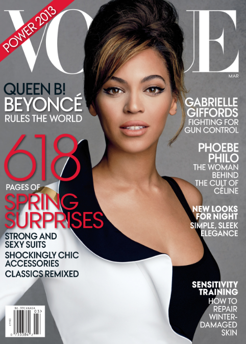
These are 2 mock up front covers just to show the different coloured background ideas I have had. I am considering having the background black as this is a unique idea and is not used commonly on magazines. This links to the theme of my magazine as my target audience are also going to be unique and quirky. 


This is a front cover I created in order to try out the use of the masthead and the placing of the teasers. I decided that I did not like this cover and changed the colour scheme and main image.

Progress of final front cover:


I started with an image that I carefully selected after analysing the images I took on a shoot with my chosen model. I chose this one as I felt it was one of the more professional photos from my shoot and I liked how the background was slightly blurred and made the model stand out more, especially the colours in the scarf and her skirt. I edited the girl in the image by using the spot healing tool to get rid of any imperfections, the patch tool to give her an even complexion and the exposure tool to make her skin seem brighter, as well as making the colours brighter. I also made the colours brighter by adjusting the contrast. 

I used tools to make the model's skin look perfect as this is a common convention of fashion magazines because it makes the reader appeal to be her, meaning they are more likely to buy the magazine. Bright colours that stand out on the main image are also a common conventions found on any magazine, particularly a regional magazine as the main image of these are usually landscapes and therefore adjusting the colours to make them brighter makes the landscape seem more desirable, causing the audience to be more likely to buy the magazine to find out where the landscape is and how they can go there and experience these views themselves.


I then added the masthead that I chose after creating a few of them beforehand so that I could see how each different masthead looked and decide which one I liked. I also added the date of the issue and the price of the magazine. I created the masthead by using the text tool, as I did with all of the text on the cover.


After this, I added the name of the main feature article and made sure it would be the most noticeable teaser on the cover by making the text the largest. 


I added a leaf pattern behind this text using a the paint tool and turned the opacity down to make them less harsh and so that the colour from the main image came through the pattern slightly. 


I then went on to add more teasers in places that were most aesthetically pleasing and in places where they would stand out the most (on this cover, over the bright colours of the main image)


I then added all the final conventions such as the barcode etc. to give the effect that it is a real media product.

 Final product:


After looking at my previous final cover, I realised that I needed to make the text more prominent as it blended into the background too much. I did this by adding a white outer glow to the main teaser and changing the colour of half of the smaller features to a new colour that I introduced to my colour scheme (pale pink/lilac) which was more easily seen against the main image. I also decided to make the masthead bigger for the same reason, so it could be seen more effectively. I also added a strapline across the top of the cover to make my magazine more memorable and to create a brand image as I can use the same strapline on my billboard and website to link the 3 products.

Saturday 21 September 2013

Draft Article

This is a draft of the article I wrote that will go on the main double page feature spread of my magazine.

AS the September leaves start to turn golden and October approaches it’s time to clean off your walking boots and get stuck in to the best muddy trails Cornwall has to offer.

Cornwall has some of the best wooded walking in the country, over the next 6 issues we are going to review a range of trails that are both breath-taking and challenging in equal measures. This week Boutique reporter Natalie Lake takes us into the heart of Lanhydrock…

Lanhydrock woodland is situated in the grounds of a prestigious
National Trust property. This is no ordinary woodland, its haunting beauty is said to captivate the dead as well as the living. Many local residents say they have caught glimpses of the mysterious grey lady whilst walking the trails.

Travelling from the slightly more urban moorland town of Bodmin, I arrive at Lanhydrock in just 10 minutes. It is a place I have visited many times before but yet I never cease to be amazed by how the journey over stone bridges and running rivers seems to transport you back in time. Pulling through the stone gates does nothing to dispel this illusion as the house itself towers out of the landscape like something straight from a Jane Austen novel.

The National Trust car park is situated at the top of the grounds and offers views of the rolling landscape, valleys and woodlands. As I pull on my walking boots the mist clears slightly revealing the beautiful autumn colours in their true glory.

I turn left after I leave the car park and follow the trail over the long, dewy grass of the meadow towards the woodlands, which is situated at the top of a short incline. The autumn light serenades me as I draw nearer to the trees. As I step inside their gentle shade the pungent scents of the ancient woodlands overtake my senses. This is woodland walking at its finest.

The trail is easy to follow allowing the mind to become occupied with the natural beauty all around. The gentle sound of wood pigeons fills the air. The bark and moss of each tree adding to the amazing autumn colour palette of the surroundings.

After 10 peaceful minutes absorbing the colours of autumn the sound of a bubbling stream can be heard. The trail takes you along a riverbank not too dissimilar to the one of childhood dreams in Wind in the
Willows.

The footpath then loops back taking me along a small hedge at the top of the woodland, it is here the fateful grey lady is said to be seen. Today there is no sign of her, only the warm rays of the autumn sun cascading through the trees.

The walk back to the car is down hill and allows to once again to absorb the breath-taking scenery of Cornwall’s finest landscape and stately home. As the woods disappear from view behind me I count myself lucky to live in such a beautiful part of the world.

Friday 20 September 2013

Flat Plans

Flat plans are essential in the planning process of creating any product as they help to make your ideas clear and also help you to come up with more ideas and see if they are effective before making the real product.

Before creating my flat plans, I created mini flat plans so I had an idea of what to include in my full size flat plans.

2 Front covers + 2 Contents pages

2 Double page spread + 2 Billboards

Final flat plans:


 Contents pages


 Front covers


 Double page spread


 Billboard


Website (homepage and 2 linked pages)


Tuesday 17 September 2013

Researching My Genre

The most effective way of researching my genre is to look at the leading magazines in these genres (fashion/regional) which are Vogue and Cornwall Today. I will analyse the common conventions of 3 magazines in both of these genres in order to know what to include in the magazine that I will create.
As I am combining 2 genres, I have to make sure I am careful and include conventions that appear on both, which is slightly difficult as they are not similar genres at all which is clear by simply just glancing at the 2 different covers.


As regional magazines have a reputation to be slightly uninteresting and as they are not the most popular genre of magazine, I have to make sure that mine does not conform to these stereotypes as I want people to buy it. This contrasts with the fashion side of my magazine as fashion is one of the most popular genres so I have to make sure I do not make it any less 'cool' by applying a regional side to it.

Synopsis Of My Ideas

The aim of my project is to create a regional magazine that has a fashion twist to it, as this is a unique idea and is a new hybrid genre that is not on the market yet. I am going to call it Boutique as this gets straight to the point and gives a very brief description of what is included in the magazine. I am also going to make sure I include teasers on the front cover that indicate that this is also a regional magazine. My target audience is females from the age of 16 to the age of 24 as I am aiming it at students in Cornwall. They are likely to be in social grades E-C1 as students and the unemployed are in the lowest social grade (E), working class (D) includes unexperienced manual workers which people of this age is likely to be as they are not old enough to have gained a lot of experience, skilled working class (C2) and lower middle class (C1).

Thursday 5 September 2013

Researching Photography

The aim of my photoshoot is to take the photos that will be used in my magazine and on my website but the most important images that will come from my photoshoot is the one used as my main image on the front cover of my magazine.

Location

Because the main objective of my magazine is to inform people about Cornwall and the fashion that is popular here I feel the best location for my main image will be either in the centre (around the shops) of a large town or city such as Truro or Newquay or in a landscape such as Bodmin Moor, a beach or a country house. By setting my images in a town centre there will be one or two clothing shops in the background of my model which tie in with my aim of wanting to incorporate fashion with landscape, which is also the reason for my idea of setting my photoshoot in a landscape such as Bodmin Moor or the beach. I think having a landscape as the background is a better idea and suits the aim of creating a regional magazine more accurately as Cornwall is known for its gorgeous beaches and its vast countryside whereas shopping is not a unique part of Cornwall. However if I was to choose the city setting I would make sure I had unique boutiques in the background, not shops such as New Look or Topshop which can be found anywhere in the UK. However, following the conventions of other fashion magazines my main image could contain my model standing in front of a plain black/white background in a photography studio which would give the image a classier look and tone.


Shots

For my main image I want to go for the conventional portrait mid-shot as this means the outfit will be a big part of the image but also as this means my model can look directly at the camera which causes the audience to feel like they are more connected to the model because they can have eye contact. Another shot I will try is a full body shot which is very similar to a mid-shot but it means you can see the models whole body including their legs and feet. The reason I feel this is an appropriate shot is so that the reader can see the whole completely outfit that the model is wearing instead of just the outfit from the waist up. As my magazine is a regional magazine, I could use a wide shot or an extreme wide shot in my main image so that it gets some landscape in, because this is what Cornwall is known for.


Cast

I have chosen one female model for my photoshoot that I feel has the style that represents the type of youngster from Cornwall that is not the stereotypical surfer, tom-boy type. Even though I feel picking a model that represents the stereotypical Cornish young person would be an easier and more obvious choice, the aim of my magazine is to show the side of Cornwall that isn't so well known and also because in Cornwall there aren't really that many girls who have the typical surfer look anyway. The outfit I would ideally like my model to wear is a smart casual style so either a skirt with a nice jumper as we are in Autumn/Winter now or a maxi dress with long sleeves. The reason for this is because if the outfit was too casual (jeans and a tshirt) this would not follow the conventions of a fashion magazine outfit and would not appeal to my target audience.


Crew

The only crew I will need is me and my model as I will operate the camera, the lighting, do the make up and hair etc and my model will get herself dressed and then model for my photos. This is good as my magazine is a small, local business and does not have a very big budget so can not afford to hire many people to do jobs that I can easily do myself.

Budget

I have a reasonably low budget for this shoot which is not a problem because I do not need to pay to hire anyone to be in my shoot or to assist me in it nor hire any locations, props or cameras/lighting etc.

Lighting

This is the typical studio lighting set up for photoshoots and is exactly what I would use if I was shooting in a studio.
But as I am shooting my images outside in a natural location, I can not use this lighting set up as there is nowhere to plug the lights in and also as this will not create the same lighting effect as it does in a studio. This means I will have to take portable lights along with me or just use natural lighting. Natural lighting may be difficult in the location I have chosen as it is an area with a lot of trees that block most sunlight so portable lighting may be the most effective option.

Other lighting setups include:

Hard lighting
This style of lighting creates harsh edges on every curve or corner in the image. It also makes shadows and the background very very dark whilst accentuating almost every flaw on the model in the image. This is not a style I would consider using for my images because these create a completely different effect and tone to the images that I want to feature in my magazine.

Soft lighting

This is the opposite to hard lighting and is a lot less harsh and a lot more fresh. This is a style that is used frequently in the main images on the front cover of fashion magazines so this is a style that I would strongly consider using if I was conducting my photoshoot in a studio where I could use a full set of studio lights. However, this is achievable by using natural lighting and brightening the image up using the brightness, contrast and exposure tools on Photoshop.

Natural Lighting

This is the style of lighting that I will be working with as I am shooting my images in a natural location (a woods). This image shows that if you use natural lighting you will get shadows and brighter spots on the main feature in the image. This style of lighting is not one that it used frequently on magazine front covers but are seen in feature spreads inside the magazine. 


If I did take portable lighting the following styles would be appropriate for the style of images that I am shooting and also for the platform and audience that my images are going to be viewed on and by:

Top half of my model accentuated. This would be appropriate because only the waist up of my model will be showing on the froth cover of my magazine as this is the generic convention for main images used on front covers. 

Full body lighting with a bit of natural lighting. This image shows a photoshoot that was done in a wooded area which is where my photoshoot is going to take place. This image looks like the photographers had no problems with lighting and it looks like they may have used a lot of natural lighting and maybe not used any portable artificial lights at all. 

Video explaining how to set up a photography studio, specifically lighting


Editing

If my images do not come out the way I want them to in terms of lighting etc, I can edit them on either Photoshop or iPhoto using the brightness, contrast and exposure tools as this will brighten the images up and also make the colours more vibrant giving the effect that it was not edited and the photos were just naturally bright. 

Equipment

The equipment I need to carry out my shoot is:
  • DSLR Camera with memory card and batteries
  • Clothes
  • Tripod
  • Make Up
  • Lighting (studio lights etc)