Tuesday 1 April 2014

Tuesday 25 March 2014

Final Practical Work

Front Cover


Contents Page


Double Page Spread


Billboard


Website

www.bodminmedia.com

Friday 17 January 2014

Website Construction


  • To make my website, I first chose a template from http://www.webassist.com/dreamweaver-templates.
  • When I was happy that my choice would support the conventions that I wanted to include and would appeal to my target audience, I downloaded it. I chose to use a template instead of starting a website from scratch because I have no previous experience with creating websites so I felt I needed a starting point. 
  • I then had to make sure to put it in a separate folder on the computer so that when I went on to Dreamweaver and went on the files section to open it, I could do it with ease and not have to go searching through the computer to find it. 
  • When I had successfully opened the first page (I started with the homepage), I proceeded to change conventions on it to conventions that I liked and that I was sure my target audience would like. For example, I swapped images that came with the template with images that I took and that suited the content that went with the image. In order to make the image I wanted to use web-friendly, I put it into photoshop and then saved it as a JPEG on a medium resolution, instead of a high resolution so that it would successfully open and load on my site. I also changed the text from the template text, to the text that I wanted the website to say.
  • I then chose to edit the HTML coding slightly in order to change visual elements such as colours and layout on the page. For example, I wanted to change the colours on the website to match the colours that I used in my magazine and billboard to create a brand image and a sense of familiarity for the reader.
  • I followed these general steps until my homepage was complete as the only things I really needed to change was the colours, images, text and the layout slightly. I then followed these same steps to create my 2 linked pages which occurred successfully. 

Saturday 14 December 2013

Billboard Construction


I started my billboard with a pale blue background and then added a layer over the top and coloured it purple, so that it matched the colour scheme of my magazine.


I then used the eraser tool to erase a rectangle shape in the purple layer to reveal the pale blue colour underneath to make room for the text and to make the text stand out more effectively.


I then added the main image that I used on my front cover to link the 2 products together. The reason that I didn't use the actual front cover is to make the billboard last longer (so I can use it when a new issue comes out, the audience will not get confused and try to look for this issue).


I then added potentially the most important convention of the billboard, the masthead and strapline of my magazine so that people know what to look for and what the billboard is advertising.


The final text that I added was information on where to find the magazine and to visit the website that goes with the magazine to find out more information and content. There is also an image of the front cover so that people know what to look for but as it is fairly small, it is not likely to be noticed as much so it will not confuse the audience into thinking this issue is still out when a new one is out.


I added this antique frame around the main image to make it stand out more effectively as the main audience of this billboard will be people who are on the move so do not have time to focus on the small details. Connotations that surround antique frames are classy, elegant, posh etc. which gives the audience an idea of what style this magazine will be and gives a slight indication to the personas of the audience.

Monday 14 October 2013

Website Analysis #2

I chose this website to analyse as my magazine is a hybrid between the fashion and regional genres; this website represents the fashion genre. 

Home page -

This home page is similar to the previous one I analysed in the sense that it shares a similar colour palette of a white background and black text. It also shares a similar layout and a very 'polished' look. The difference however is that this website takes this 'polished' effect and makes it the most important aspect of the page. This is because Vogue has a reputation as the world's most important and influential fashion magazine. It does not want to appear to need the readers as it is so stylish and prestigious that the readership is required to follow Vogue's rules and they are guaranteed to do this because of how high a status this magazine has.

The colour palette of black and white used on this website reinforces the point I was previously making as they do not need to use bright, bold colours to get their readers' attention as Vogue does not care to create eye catching features and text because they know they will always have readers. Another reason for this colour palette is likely to be because black and white are extremely stylish and classy colours which also happens to be the connotations surrounding Vogue. Another convention that this website has taken and made into their own is the side bar which enables the audience to be able to navigate their way around the site. The colour white carries connotations such as 'pure' and 'innocent' which hints to who the target audience of Vogue are. These connotations suggest that Vogue wants their audience to be pure and innocent and by using these colours, they are more likely to draw this type of person in. For example, white is rarely seen being used in magazines and on websites that have the opposite target audience (such as Kerrang! who's target audience are stereotypically far from pure and innocent because they listen to heavy, loud and violent music and are proud of it). The colour black carries a wider range of connotations than the colour white does, and it is used universally on websites that appeal to any audiences. However, in the fashion world, black is the colour that carries connotations such as 'classy', 'chic', and is stereotypically the colour that suggests a person is fashionable and keeps up to date with fashion. This is seen in the use of the phrase 'little black dress' which is the safe option when deciding what to wear because it will always be in fashion, pleasing on the eye and will typically make you look good as it suits any skin colours and personalities. This suggests that Vogue wanted to go for the 'safe' option when choosing a colour palette as these 2 colours (black and white) will never go out of fashion and also appeal to most personalities (which goes against their carelessness of wanting to attract any kind of audience and rather suggests that they want to attract any type of audience.

As this magazine is well known for using high end designer clothing and accessories the text 'The £200 wardrobe' disputes a lot of connotations that surround Vogue as in a normal issue of Vogue there would be very little items that are under £200, let alone a whole 'wardrobe'. The target audience is mainly women who have a large disposable income so can afford items shown in this magazine so this feature is not likely to appeal to them. This text is almost as big as the masthead and is in the centre of the home page which shows that it is the feature Vogue want the readers to read the most out of any others on the site. This is interesting as this feature disputes connotations that surround Vogue such as high end, elite etc as you would not be able to buy any designer items for under £200 so therefore are not worthy of being featured in Vogue. A convention that suggests Vogue are aware of this fact are the fonts used. The text '£200 wardrobe' is in a different, more plain font than 'Vogue' is. This suggests that even if you can get a whole outfit for £200, you will just be plain and will definitely not reach the standards that designer clothes are at. The strapline underneath the main text of this feature starts with 'sort yourself out' which is another reason that shows Vogue are aware of the connotations that surround non-designer clothing in the fashion world. Telling the readers to sort themselves out is suggesting that people who can not afford designer clothes need to sort themselves out as they are more than likely a 'mess' as they do not wear designer clothes.

The links at the top that show the audience what is currently 'trending' supports the idea that Vogue have a strong sense of power so they can dictate what is 'cool' and what is not. This is what the readers of this website absolutely have to know about as it is what everyone in the fashion world is talking about and you will be out of the loop if you do not know about these trends. Marx suggested that media platforms design their products especially to maintain their sense of power and make lower class people stay lower class. This relates to Vogue as they are extremely powerful and maintain this by creating the trends and strongly reinforcing them. They make sure lower class citizens stay lower class by featuring high-end fashion in their magazine and website which the lower class definitely can not afford. They also make sure that the lower-classes stay there by making the physical copy of the magazine around the £4.00 mark; a price that only those with a large disposable income will be able to afford. This suggests that the social grades of the target audience of Vogue is B-A (middle class to higher-middle class, including anyone above A (high class)).

The mise-en-scene on this page includes the female model wearing dark clothes and dark make up which matches the colour of the text - there is no colour at all on this page except in the section where they are advertising that you can subscribe to the magazine. These clothes make the model stand out as she is against the white background and makes her look the centre of attention a long with the text next to her. Another feature of the model which shows she was more than likely chosen on purpose is the colour of her skin. As she has fairly dark skin, the contrast of this on the white background causes the eye to be drawn to her. By using a model with darker skin and a more Oriental look than the average reader (the average reader of Vogue is aged 37 and mostly white females), it is likely to give Vogue a wider target audience and makes the magazine seem more versatile and slightly exotic. This model reinforces the stereotype of high-end models being skinny as she has sharp cheek and jaw bones which means not only does this follow generic conventions of a magazine, this is likely to appeal to almost every reader of Vogue as they are highly likely to aspire to look like this and also wear similar clothes to the ones that the model is wearing as the target audience will see how classy and sophisticated she looks so they will want to go out and buy these clothes so they can look classy and sophisticated too. This gives an indication of the target audience as they will typically be females because of the female model in the main image.


Linked page #1 -

My first linked page uses exactly the same layout, colour palette and fonts as the home page but the variation being how the content is featured on the page, but even this is not very different from the home page and even more similar to my second linked page below. This gives the website a more classy, professional and 'clean' look as there is no unnecessary information, adverts, images etc causing clutter; this is interesting as in their printed magazines there is an enormous amount of adverts.

The text that was the largest on the home page is now not the largest which suggests that on the home page they made 'Vogue' the largest text so that it is clear of the website the audience has come to but when they get to the linked pages it is not so important anymore as the audience will know by now what website they are on; what is important is the content. This shows that the aim of this website is not to attract a new audience or to promote their name but to inform their existing audience on things that are important to Vogue in the fashion world and if it's important to Vogue it will be important to the readers, this links to the feature at the top of each page that tells the reader what is 'trending'. Another feature that links to this is the text 'You're all wearing' which makes the reader think that everyone is wearing these things. However Vogue did not want to be subtle about this and added the strapline 'Did your style make the cut this month?' which suggests that if it did not, they need to go out and buy these clothes straight away as if they are not wearing these clothes they are not 'street chic' and must go out and buy clothes of this style straight away else they are not cool. This relates to the Hypodermic Needle Theory which suggests that powerful media figures (such as Vogue) can use certain tools such as images and vocabulary to control their audience and 'inject' ideas into them.

Another feature that adds to the 'cool' connotation is the poses and the way the women are standing in the images used on the opening page of this linked page. These are not typical poses that women on the street would naturally stand like, it is almost as if Vogue had staged a photoshoot to look like it was taken in a natural environment of natural women who have no experience in the modelling industry. This means that the verisimilitude of the images is not strong as they do not seem as if they were taken in the middle of a busy street and of completely normal women who have no experience in the modelling industry (which is what the term 'street chic' suggests).

The font used for the text 'You're all wearing' is more casual and 'messy' than the fonts used on other pages of this website. This gives the impression that because this page is about the audience of Vogue, it does not need to seem so classy, is the page Vogue puts the least effort into and does not need to conform with the rest of the website so that it stands out, as the rest of the websites content is mainly professional models and fashion designers. The text 'You're all wearing' is talking directly to the reader which will make the reader feel important and included in a world that usually only includes high-end models and designers.  Even though this page can make the audience feel bad about themselves because they do not own any clothes that 'made the cut this month' it can also make readers feel good about themselves if they do own these clothes because the text talking directly at them gives the impression that Vogue know that they exist and will accept these readers into their world. 


Linked page #2 -

Similarly to the previous linked page which is also about the trends of this week (which is obvious as Vogue is a fashion magazine so they will not be talking about much else other than fashion) this has the title 'Fashion trends' which is similar to the previous page but this has models wearing the clothes and is about what is fashionable on the runway rather than the general public on the streets. The link for this page is higher up on the sidebar as this will highly appeal to dedicated typical Vogue readers as the catwalk is a vital part of the fashion industry and the only 2 things higher than it is news and fashion shows which are the 2 things people will come onto the website to view. A running theme through all of Vogue's pages is that there is not typical colour scheme in the images used, only the background and text. A similarity the linked pages do show however is the layout.

The target audience for this page is slightly different to the previous as not every reader of Vogue is interested in catwalk fashion as it is quite 'far out' and not what 'normal' people on the street will wear, unlike the clothing that is featured on the previous linked page. Another aspect that suggests that the target audience is different for this page than the previous is the poses and looks of the women on this page. On the previous page the models seemed 'cool', 'beautiful' and very stylish but the women on this page have a completely different look so even though the models on this page are catwalk models they seem more approachable and natural than the ones on the previous page. Vogue's use of colour on this page suggests that the target audience may be younger than other pages on their website. This is because Stanley Hall (1904) stated that youth need excitement else they will turn to violence and alcohol abuse etc. The excitement on this page is in the form of bright colours as they make this page seem more exciting than the previous ones (which were generally dull colours, if any).

A feature that sets this page apart from the other linked page is the graphology used. The text on the side of the main images on this linked page is in a different font to the text on the previous linked page and is a more classic font whereas the font on the previous page is 'sloppy' and much more casual. This font also matches the font used on the main feature on the home page which is surprising as that feature is directed at cheaper clothing etc whereas the fashion used on this linked page is high end as it is straight from the catwalk so it would be expected that the main feature on the home page would have the 'sloppier' font as it ties in with the feature more.

The use of the word 'desire' on this page denotes that the readers should be passionate about the fashion featured on this page because they 'desire' it. This links with the use of the word 'dreamy' as it denotes that the audience have been or will be dreaming about the fashion featured on this page, which suggests that the target audience is people heavily influenced by fashion.

The women featured in Vogue are carefully selected so that they make the clothes they are modeling look as good as they possibly can, in order to make the audience buy them. The women are also carefully selected so that people will buy the magazine and visit the website because they want to see more of these women whether it's because they are attracted to them or aspire to be like them. This is a prime example of Laura Mulvey's Female Gaze which states that women look the way they do in media products in order to attract an audience who want to look at them or look like them. 

Sunday 13 October 2013

Website Analysis #1

I chose this website as this is an excellent example of a regional website and it also represents the style of website I want to create. As my chosen genre is regional but also mixed with the fashion this website will be an example of the regional side. 

Home page -


Just by looking at this website I can tell exactly what tone they are trying to portray about Cornwall, this it is a modern, attractive and exciting county. This however is not the reality but these 3 images would have you believe it is. The first image, which is of someone playing polo on a seemingly empty beach, portrays the idea that Cornish people have a disposable income so have enough money to spend on luxury items such as horses. This could also be their own private beach as there is no other people on it. It appears to put Cornish people into an elite group as Prince William and Prince Harry famously enjoy a game of polo; this suggests that Cornish people are of the same level as royalty and that they are just as wealthy and 'posh'. All 3 images follow the idea of Cornwall's landscapes being empty and completely untouched by the human race. It gives the audience the idea that everywhere in this county is very private and magical, completely different from cities upcountry where most of the holiday makers will come from. The reason this website uses images like this and not the reality of Cornwall is because it costs a lot to come on holiday here and people would not visit if they knew the reality. Another reason images of the reality are not used is because Cornwall has connotations such as 'mystical' and 'tranquil' surrounding it and these illusions would be shattered if the reality was revealed. This leads me to the layout. The way the header and body are laid out on this web page is stylish, creative and modern, which also happen to be words used to describe the up and coming parts of Cornwall.

This is the reality of Cornwall in the summer; very busy and crowded.

The largest piece of text on this page is in the top left corner and reads 'Visit Cornwall' which is the name of the website but is also the exact aim of this website summed up in 2 words. Everything on this website is all to convince people to come to Cornwall. Each page of the website has the same logo in the same place and is the same size. This is a feature that is different from the Vogue website which supports my idea that Vogue do not need to convince and persuade people to read the magazine and visit the website etc as they know they will always have an audience and they are not bothered about drawing in a new audience because they simply do not need it. This is different from the Visit Cornwall website as this website does want a bigger audience and care very much about it, so much so that this whole website is dedicated to this very aim (whereas Vogue's websites aim is to inform and almost 'boast' about how much they know and how much power they have to make things 'cool').

The colour scheme used on this home page is quite broad as there is 9 or 10 different colours used. This matches the connotations that surround a family holiday as usually there are a lot of people going which matches the theme of a lot of colours used on this page. Another connotation is excitement which can be seen on this page in the form of a lot of colours in the colour scheme, for instance if the colour scheme was black and white (like Vogue) this would not suggest excitement but instead suggests the opposite. Another reason for the colour scheme is that this website does not have a sole target audience but is just targeted to most ages, both genders and every type of personality as holidays are something everyone does. Every detail on this website is created in a way that it appeals to almost everybody. Another aspect that suggests this website has been designed to appeal to every age and every personality is the size and font of the text. Stereotypically older people (and any ages that just simply have poor eyesight) will need larger text to be able to read it so in order for this page to accommodate these people, they must have large text. They must also make sure they choose a font that is easy to read and see.

The largest text on this page is likely to be the name of the website, however this is about the same size as the name of the feature that is being advertised on the page. This suggests that the website are not overly bothered about whether you are completely aware of the name of website as it is the content that is important. The reason they are not bothered whether the audience know the name of this website is because they are not a company who will gain money from their audience as their main aim is to attract visitors to Cornwall therefore meaning that the county will gain money, so the important factor of the website is making sure the audience is aware that this website is about Cornwall. This is noticed in the title as the word 'Cornwall' is bigger than the word 'Visit'.

Linked page #1 -


This is my first linked page from Visit Cornwall. There is an obvious difference in layout of the body on this page than the home page which helps to differentiate between the content shown on each and the aim of each page (the aim of this page is to inform the reader on what is going on in Cornwall, whereas the aim of the homepage is to introduce the website and tell the reader a bit about what is on each page of it, they do this by using teasers which are supposed to intrigue the reader enough so that they read the whole article). The header is the same which adds a sense of 'safety' and familiarity which means it is quick and simple to navigate the site no matter which page the audience is on. This suggests the target audience is males and females (although the colour palette would suggest stereotypical that the target audience is specifically females as the text colours are very bright and especially on this page with the text being pink, a colour that is associated strongly with females) aged 30+ in the social grade C-A. This is because holidays are not cheap so in order to have one you must have a disposable income. It may also appeal to people in a lower social grade than this who have aspirations to go on a holiday to Cornwall some day when they can afford it, they may use the information and images on this website as motivation to earn enough money etc.

There is no indication whether this web page is targeted at couples, couples with children, single people, elderly people etc. which means that it will appeal to all ages and lifestyles but it is very likely to be directed at a mass audience instead of a niche audience. Another reason for it likely to appeal to all ages and lifestyles is that the page is very user-friendly so  even people who have very basic computer skills will be able to use it. It is easy to see that it is a user-friendly site as there is easy to read, bold text, easy site navigation because of the simple layout and drop-down menus to refine which results show up for you and because there is a 'customize your visit' option in the top right hand corner which will make the site exactly how the audience likes it.

The main image on this page is another photograph of Cornwall in its element (which is a running theme through each page of the website) and again is to persuade the readers to come to Cornwall. It shows the sea looking blue and calm (which as shown in the image above is not often the case), the sky looking a nice shade of blue and the weather being generally tranquil and is probably warm. It also shows that the beach is very busy which suggests that this is a very popular place to come on holiday and according to this picture, there is a reason for this. It also suggests that the reader of this website is the only person to not be in Cornwall on holiday and are missing out which is a simple psychological mind trick which makes the reader subconsciously want to come here so that they are not missing out. This links in with the Hypodermic Needle Theory as this media product is manipulating the thoughts of the reader which makes them want to do what this website is telling them to do (visit Cornwall so that they do not miss out on what everybody else is doing). This image does not have anything to do with what is on this linked page which adds an air of mystery and is saying that they are not going to say anything about it as you have to come here to find out for yourself; as many people have by the looks of this image.

Linked page #2 -


This page is very similar to the previous page except for the tone and content, this indicates that the site is reliable and sensible as well as trustworthy which is good as this is a website trying to attract visitors to Cornwall and if they felt like they could not trust the things that this website says about Cornwall they would not be inclined to come here. By this page the audience is likely to trust the website as they would more than likely have been on a number of other pages before this. To maintain this trust, the website has to make sure everything fits in and that the layout, typography, images etc all stay relatively similar and has no unexpected features (unlike Vogue who do not stick to sensibility and give a 'we don't care' attitude to what goes on their website, as long as they think it's cool. The tone of this page is more dark and dull as it is a page that the main audience will be less interested in whereas the 'What's on' page will be the page that the audience is most interested in. The main convention that suggests the dull tone is the colour scheme. It is obviously because the text is a dark colour but the reason for this is because the website knows this will be less viewed than the previous page so it is almost as if they did not try very hard. This is the opposite to the previous page as the text colour is the very bright colour of pink. The target audience for this page in specific is very likely to be solely adults as it does not use bright colours that will excite and entice a younger audience. The content on this page suggests the same target audience also as if a family was planning a holiday to Cornwall, the adults would be the ones to decide where to go/where to stay.

The verisimilitude of the main image on this page is strong as this is what Cornwall looks like. It has not been edited to look more appealing or exaggerated to look more like a more luxurious holiday destination such as the Caribbean. The only control of this image was that it was taking on a nice, sunny day which is when Cornwall looks its best. Something that has been slightly adapted is that this image is supposingly representing the towns and villages of Cornwall which gives the impression that a lot of towns/villages in Cornwall have views like this and have access to water when this is not strictly true. There are lots of yachts and boats featured in the main image on this page which implies that people living in and visiting Cornwall have a lot of money and live a lavish life style and suggests that this is the life you could live if you came here.

The Frankfurt School theory suggests that the media can turn anything into something people would pay money to see or own. This then makes the product untrustworthy and dishonest as the media are trying to make the product the best they possibly can so that they can gain money. This theory relates to this website as there does not absolutely need to be a website about Cornwall and something that really reinforces it is that there are a high number of websites about Cornwall, when there doesn't even need to be one. These websites do not need to exist as the information they contain can be found elsewhere such as in travel agents. As there are so many websites, they must make sure that the information they contain must be more effective and more interesting than every other website, which means that most websites will be stretching the truth as far as they can so that the audience think their website is the best one and so that the readers visit Cornwall because of this website. This includes editing images to make Cornwall look magical and exotic (something that is seen on the home page of this website by the use of the text 'mystic moorlands'). It also includes slightly twisting the truth for example, saying that Cornwall is the most luxurious place in the country and the closest you will get to going to a foreign country without actually going there. 

Tuesday 1 October 2013

Billboard Analysis

When I was researching billboards I found that magazines are not widely advertised on billboards so I decided to pick 3 that I thought were exciting and analyse them so that I gain knowledge for when I create my own. 


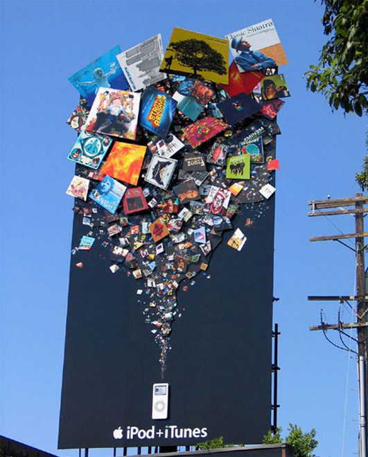
This billboard from Apple is very unique and portrays what point they are trying to make simply but excellently (that the iPod is capable of holding all of these things that are coming out of the image). It is exciting, eye-catching, and extremely modern (something Apple strongly represent), this means this billboard will do its job to its full potential. This billboard does not follow common conventions as if it did it would not be seen as unique. A few examples of conventions it does not follow are that it doesn't have a tag line, any additional text other than the products it is advertising even though it does not necessarily even have to have this text as Apple is so widely known the audience would know exactly what this product is anyway but if it didn't they wouldn't have a chance at attracting new customers as they wouldn't know what it is (which is the point of advertising). The most obvious convention this billboard does not follow is the generic shape of a landscape rectangle that a billboard usually is. This usually would not be a feature that would be considered changing when creating a billboard as the landscape shape is seen as working more effectively as you can fit more content on it, but Apple decided to go against this convention and were effective in doing so as they did not need the extra space they would have got if this billboard was landscape as well as creating a new modern take on this style of advertising. This may suggest that the type of audience that they want to attract are people who do not see themselves as 'mainstream' and are also willing to take risks, put unique twists on things and enjoy the modern slant that products have on them these days (such as Apple products being touchscreen etc). 

The target audience for this advert is any gender of any age as Apple products do not have a specific age range and they take pride in targeting their products to all ages. This is seen on the colours used in the items that are coming out of the iPod as they are bright and vibrant which is usually linked to children. A few factors that goes against this though is the background colour of black and the text colour of white. Dark colours are more linked to males as is technology in general and white is a neutral colour not linked to either gender but if this was aimed at women there would more likely be a stereotypical colour such as pink or purple so just by this advert alone I would connote that the target audience is Western males of around 24-35 in social grade A-C who have a disposable income to spend on luxury items such as this. The type of personality this billboard is likely to attract is aspirers. These are people who look to the media to define themselves so they must only use the most relevant and 'cool' media products else they will not feel good about themselves and feel as though people think they are not relevant and cool. 

This billboard implies that the company does not actually need to attract new customers, and that they have just used this advertising space to prove to the public that they are a modern company in all fields not just technology and are capable of taking the 'top spot' in advertising as well as technology. It also implies that they have enough money to waste on expensive advertising; it is a waste as it has minimal advertising on it and only really appeals to audiences that already know of this product because there is no information on this billboard explaining to new customers what the product is.

Stereotypically electronic products, such as the items produced by Apple, attract teenagers and young people aged 13 - 24. This means that Apple would have to make sure their advert appeals to young people. One way they have done this is by using bright colours. By doing this they support Stanley Hall's theory (1904) that young people need a constant source of excitement (represented on this billboard as bright colours) else they will not pay attention to it and will seek it in other forms such as violence and alcohol. 


This billboard advertising BBC World news channel takes full advantage of the space they were given, which would have otherwise been very ineffective. The image for this billboard has been carefully selected so that one side of the image implies a certain connotation until you get to the other side of the billboard which shows the whole image and the truth of it. The image is of one of the most controversial topics in the world at the moment and it causes the audience to stop and think about it which they are not likely to do on a daily basis as it is likely to be placed in a busy city such as New York or London, where people generally do not have to deal with any situations like the one happening in this image. This is good because the BBC would be wasting money if they advertised without having another aim (similar to the previous Apple billboard I analysed) as the BBC is the most well known broadcasting company in the world and therefore do not need to advertise as almost everyone knows of them anyway. As well as making you think about the topic shown on the billboard, it also makes you think about billboards in general and how they work. This is because usual billboards show the company using their space to solely advertise their product/company which means that this challenges the usual conventions of a billboard. 

The lack of colour on this billboard suggests that the target audience will not be young people (around the ages of 13 - 24) (Stanley Hall's theory of young people needing everything to have bright colours and images etc else they will not be interested). The lack of colour on this billboard suggests it will appeal to older generations and these generations are also stereotypically the ones who keep up with the news and enjoy it. Young people stereotypically do not enjoy the news and do not keep up with it. Another reason why this is not likely to be aimed at young people is because none of the people in the main image of the billboard are young which means there is nothing for a young audience to relate to (one of the most effective ways of getting a young audience to be interested in your product is to include aspects or personalities that they can relate to). 


This billboard challenges the generic conventions of a usual billboard. The main convention that does this is the lack of images on the advert. This is so your eyes are drawn completely to the text and even more so, the man on the top of the billboard as if this was not noticed the advert would not make much sense and the advert would not be effective. Every convention of this billboard leads to seeing the model sitting on the top as the text is implying this is speech from the model which then implies that the BMW garage is very close to this billboard making passers by turn around and see where it is which may result in BMW getting more customers which is the ultimate aim of an advert. 

This whole billboard suggests the target audience. The first feature to do this is that there is minimal text which accommodates drivers passing buy, the most likely audience of this ad as if you can not drive you will not be buying a car which is the sole item that BMW sell. The dulled colours on this billboard suggests it is not aimed at young people however the dulled colours could also be because it does not want to distract drivers who drive past it as this will take their eyes off the road and potentially cause an accident and also because the bright colours will take away the focus from the man sitting on the top, which is one of the two things that needs to be seen on this billboard. Because of what this billboard is advertising, it can not be aimed at very young people anyway as the legal driving age is 17 in the UK and 16 in America. Stereotypically, males are the gender that are interested in cars so the dulled colours may also suggest that it is mainly aimed at males as if it were to be stereotypically aimed at females it would be bright colours of pinks and purples. 


As I am creating a regional magazine that is directed more towards to fashion side of Cornwall I thought it would be important to analyse a fashion billboard as well. The reason this billboard is interesting is because it is 3D, exactly like the bottle of the perfume it is advertising. Also the background is made to look like 3D grass which is because the perfume is called Daisy and these are found in grass and also so it makes the 3D daisies and the billboard in general look even more effective. 

The location of this billboard is interesting as it is not in the area where the target audience of this perfume would be. It seems like it is on a busy road with road works etc taking place which is not glamorous or fashionable, which are strong connotations of this perfume and brand. However as it is on  a busy road it is likely to be viewed by many more people than if it was in a less built up area. Another reason for it being on the side of a road is because the target audience is likely to be in social grade A-C as this is a high end perfume by a high end fashion designer which means they are highly likely to own a car.

The colours used on this billboard symbolise what the perfume is likely to smell like; bright, girly and florally. This is clever as you obviously can not smell the actual perfume on a billboard so this gives the audience a slight indication as to what it smells like and without this people would be less likely to go to a shop and try it as they would have no idea what it smells like and would not know just by looking at this advert if it would appeal to them. These added flowers also connote what type of person this perfume is most likely to appeal to. For instance, it is obvious by looking at this that it is not a fragrance for men as the whole billboard is very girly. It also seems as though it does not appeal to tom-boyish types and only the girly-girls because of the flowers. As I mentioned before, it is likely to appeal to social grade A-C because they will have a disposable income to spend on things such as perfume, especially a high-end one like this.