Before planning my music magazine I need to do a series of studies to find out who the primary target audience will be. As Hall & Holmes once said: "Any media text is created for a particular audience and will usually appeal most to this particular target audience" (1998).
Knowing my target audience is very important because if I do not know them properly they will not be drawn to my product and it will not be successful.
There are a few ways I will categorise my audience. These are representation theory, social class and the uses and gratification theory.
The two main types of audiences magazine institutions which are mass audience and niche audience.
Mass Audience: These are large mainstream audiences who consume popular or mainstream culture (according to Marxists this audience is mainly made up of the 'working class').
Wednesday, 27 February 2013
Tuesday, 26 February 2013
Target Audience
Every successful product has done in depth target audience research before creating the product to find out what kind of things they should include to make it appeal to their specific audience. They also do target audience research after they have created the product to find out if it lives up to the expectations of the audience. The type of target audience they do includes mainly questionnaires/surveys.
Applying The Uses And Gratification Theory To My Product
The uses and gratification theory is an idea of how and why people use the media to satisfy their needs. For instance, people read magazines for entertainment, to gain education and for relaxation. Blumer & Katz (1974) are the main theorists who support this idea.
The type of audience I want to read my magazine is the same audience who read magazines such as Kerrang! and Rocksound. Girls and boys who like rock and alternative music, from the ages 14-24. I would like for my magazine to be available to people in as many countries as possible however news and events such as tours will mainly be in the UK, America and on occasion the rest of Europe (mainly Germany, France, Spain etc). According to Hall teenagers/young people like to rebel and their behaviour is of an extreme type so my magazine will most likely conform to this stereotype so that it appeals to these types of people. The social class who is the most likely to read my magazine is class E - students and unemployed, however it may also appeal to those in class D - working class, as the target age of my magazine is from student age to an age where a lot of people this age are likely to have jobs, therefore falling into the category above.
 I created a survey monkey and asked my target audience a few questions that would hopefully give me a better understanding on what my audience want to see in a new rock/music magazine.
I started off by asking their age and 100% of people answer 16 - 18 which means they are right in the middle of my target audience, making them a reliable source of information and meaning that their opinion will be useful.
 I then asked what genre of music they listened to and enjoyed the most and 100% of them answered with rock, which is ideal as this is the genre that my magazine will be based on. This means that the results they give me will be valid and reliable as they know what they look for in a rock magazine whereas people who like pop music for example will not know much about rock therefore will not know the common conventions of a rock magazine and will not know what they look for in one.
 100% of the people I asked said the factors that would make them buy a magazine if they saw it on the shelf in a shop were the main image, feature articles/teasers and certain band names/photos featured on the magazine front cover. This tells me that I must be careful and precise when choosing what images and band names I put on my front cover as this is the convention that will draw the largest audience in. If I did not do this survey I may have been inclined to think that the masthead was the most important part in choosing whether to buy a magazine or not and put more thought and careful analysis into choosing the right masthead when in reality this is the least important thing.
 A factor that is not entirely useful that I discovered from this survey was that 100% of the people who answered were females. This means that there may be a biased opinion on what my audience wants in a magazine as males may want something different but overall it doesn't matter too much because there is no gender specific conventions on my magazine.
Applying The Uses And Gratification Theory To My Product
The uses and gratification theory is an idea of how and why people use the media to satisfy their needs. For instance, people read magazines for entertainment, to gain education and for relaxation. Blumer & Katz (1974) are the main theorists who support this idea.
The type of audience I want to read my magazine is the same audience who read magazines such as Kerrang! and Rocksound. Girls and boys who like rock and alternative music, from the ages 14-24. I would like for my magazine to be available to people in as many countries as possible however news and events such as tours will mainly be in the UK, America and on occasion the rest of Europe (mainly Germany, France, Spain etc). According to Hall teenagers/young people like to rebel and their behaviour is of an extreme type so my magazine will most likely conform to this stereotype so that it appeals to these types of people. The social class who is the most likely to read my magazine is class E - students and unemployed, however it may also appeal to those in class D - working class, as the target age of my magazine is from student age to an age where a lot of people this age are likely to have jobs, therefore falling into the category above.

I started off by asking their age and 100% of people answer 16 - 18 which means they are right in the middle of my target audience, making them a reliable source of information and meaning that their opinion will be useful.


Feature Analysis

This feature article is from Kerrang! magazine and has used a slightly unique layout as it is not text heavy at all but it still manages to look balanced and stylish. The reason there are more images than text is because the article is informing the readers about the 'Kerrang! Relentless tour 2010' and the images are of the bands that are on the tour, getting bigger as they get more well known/popular until the main image (the one taking up most of the right hand page) is a member of the band that is headlining the tour.
The colour scheme consists of 3 colours on this double page spread which are blue, white and black. The white of the text is to correspond with the images as in the main image the man is wearing a white tshirt, as is a man in one of the smaller images, and it is also to correspond with the background of 2 images. The black of the colour scheme is simply the rest of the main image setting the background for the text, however it may also be because the article is about a concert which is generally in quite a dark setting. The usage of black was most likely chosen because black is the stereotypical colour that is associated with this genre of music (rock; which is easy to tell just by looking at the images because the main image features a man playing an electric guitar (the generic instrument related to rock) and also because Kerrang! is well known for featuring rock bands) and also because black carries connotations such as rebellion, mystery and dark feelings (which are generically portrayed in songs from the genre of rock).
There are quite a few different typography styles on this double page spread making it look fairly messy which relates to the personas of the target audience. This is because rock is about rebellion and therefore the consumers of rock make an effort to look different to society's norms and they also make an effort to make it look like they have not made an effort to look good because they simply do not care whether people think they do or not and this means they end up looking fairly messy (with messy hair and clothes that clash, ripped jeans etc).
The Relentless logo on the top of the first page is there because they are the official sponsors of the tour, however if you did not know this it would not be made obvious just by looking at it and if you did not know this you would think it was just a word the magazine was using to describe the festival which would not be surprising as rock concerts are generally energetic and fairly rough. This is a good sponsor for Kerrang! to have as it is an energy drink aimed at young adults which is also who the Kerrang! tour is aimed at. Relentless symbolises the same thing that Kerrang! concerts aspire to be and the audience attending the concert want to be, energetic and fun (which are the physical implications that would come from drinking an energy drink such as Relentless). This relates to Stanley Hall's theory (1904) that if young people can't get entertainment, they will turn to rebellion and alcohol etc to get it.
In terms of mise-en-scene, the clothing that the people in the 3 smaller images are wearing are all dark colours which stereotypically will appeal to the target audience of Kerrang! as this is the type of clothing they wear and the type of clothing they will be attracted to people wearing because it means they will be able to relate to them. Speaking of target audience, the type of audience I would expect Kerrang! to have by looking at this article is from the age of 14-24 and in social grades E-D. I think this because there is not much text in this article but mainly images, which are of people who are not in threatening poses or swearing etc. Another reason I think this is because of the sponsor, Relentless. This appeals the most to teenagers as they see it as something like alcohol in the sense that it makes them more energetic and changes them slightly, but it is not dangerous and illegal. I think this is more likely to stereotypically appeal to males as there are no females in any of the images meaning they will not be able to relate or aspire to anyone, whereas makes will. I also think it is more likely to appeal to males because they (stereotypically) are the gender who consume rock music more which may be because women are seen to be innocent, gentle, elegant etc so they are less likely to enjoy loud, heavy, rock music with a lot of swearing and aggression in it.

This is a feature article from Rocksound magazine which, unlike the previous one I analysed, is just about one band. Just from a quick glance at this you can tell that it is likely to be controversial and only appealing to a niche audience as there is swearing and words such as 'sacrifice' in bold letters that catch your eye more than the smaller text that is likely to be less controversial but not as interesting (this is an example of how the media creates and reinforces stereotypes as the genre of this band/music featured in this magazine is said to be 'rebellious' and 'controversial' but usually generally isn't). Another reason this article is straight away seen as controversial is the faces the band members are pulling in the main image, they look like they are a mix of angry, aggressive, laughing and sarcastic.
This relates to Medhurst's theory that the middle-class producers of text say that "they are awful because they are not like us" which is taken to the extreme when presenting people from social grades C1-E (such as the people on this feature article because they are too young to have an established career, their presentation (facial hair, clothing etc) is not as classic as the middle-class males who produce media products and the language they use (a lot of swear words)) as the producers accentuate their flaws and take them to the extreme in order to make them look even more 'awful' (this may also be done to make the reader feel better about themselves).
The colour scheme of this article is again black, white and blue although the main colours are black and white. This is a theme which runs through music magazines of the rock genre and is done purposely because if the colour scheme was, for instance, pink and yellow, the band and article would not be taken in the same way and they would no longer seem controversial and rebellious and would probably not attract the same audience as the usual readers of this magazine and usual listeners of this band as they would be surprised to see these colours in this magazine.
This article is also image heavy instead of text heavy, infact there is hardly any text at all. The lack of text means this double page spread challenges conventions of generic double page spreads. The name of the band is the largest bit of text which makes it easier for the reader to decide right away if they want to read the article or not because they might like the band or they might not, if this bit of text was small it would take longer to find, meaning the reader might not find it and give up therefore not reading it and missing out on something they would like to read about. Another reason that the bands name is the largest section of text is that it makes it look more balanced and structured, for instance if the subheading was bigger it would not look as effective. There is a large section of text at the top of the left hand page which introduces the band and explains what the interview will involve etc. This is important as it gives new fans/people who don't know much about the band a chance to educate themselves before reading on.
Contents Analysis
For my AS coursework I have been assigned the brief to create a magazine front cover, contents page and double page spread so in order for me to be fully aware of the common conventions of each of these, I need to analyse existing products. Having already analysed 3 front covers, I will now analyse 3 contents pages.

The main image is a medium shot of a non-threatening girl (casual clothing, natural coloured hair etc) extending her arms out towards the camera, as if to invite the reader into reading the magazine, with a slight smile on her face, there is a number at the side of her which is indicating that on that page in the magazine there will be a feature on her (probably the main feature as this is the biggest image). Even though the main image on this contents page contains a female, she is not the stereotypical 'cover girl' that makes women aspire to be her so for this reason I would say that the primary target audience is males. This links to Laura Mulvey's theory of the male gaze (1975) which states that women in the media are sexualised for the enjoyment of males. However, this image slightly challenges this theory as the girl in this image is not being sexualised in terms of what she is wearing or the poses she is doing. It is not a common convention for females to be used in the main image on a rock magazine because the primary target audience is males so they would not likely be able to relate to a female. The female in the main image is looking directly at the camera which means it gives the effect that she is making eye contact with the reader making it more personal and that they are being invited in to the magazine, making them more likely to purchase it.
The block of text on the right hand side (the main section of contents information) is neatly arranged so that each 4 or so pages has a subheading explaining which section will be (for example, posters, reviews and news). This makes it easier and faster to go directly to what you are looking for in the magazine which is a positive if someone is debating whether or not to buy the magazine or not as they will be able to see the content in the magazine quickly or if someone wants to buy the magazine just for one particular section as they will be able to see what is in this section and decide whether it is worth purchasing. The neat styling and positioning of the text boxes on this page go against the connotation and denotations that surround 'punk' which is why they have put the images of the features of the 'pop-punk' category in a slightly messier way over the main image as these conform more to the connotations of punk (trouble, not conforming to society's expectations, rebelling, messy etc).
There isn't any obvious colour schemes on this page except for the fact there is lots of yellow. This may be because the bands featured in Kerrang! are seen as rebellious, not mainstream and want people to look at them so that they can see that they are different and the people who read Kerrang! aspire to be like this; Yellow is the colour that is disliked the most and the brightest therefore catching peoples eyes and also relates to the target audience of this genre/magazine as they want to be disliked which is why they rebel against the social norms. However, there is also a surprising amount of pink and blue on the page which is surprising because stereotypically Kerrang! readers (14 - 24 years old, mainly heterosexual males because of the girl in the main image and also because they are stereotypically the gender that listens to rock music) do not like these colours, but of course the magazine could have taken that fact to mind and done this deliberately as reverse psychology (telling people who fully believe the stereotypes are true that they are in fact not true). This also may be because the areas which are in pink are advertising Kerrang!'s 'pop-punk' features which is generally seen as the 'girlier' area of rock and males stereotypically do not listen to it as it is not 'heavy' enough for them. This feature and the use of the colour pink (which is a colour stereotypically linked to girls) may have been used to try and draw in a bigger female audience than they usually have as females generally would not buy this because of its boyish connotations and how it is usually not directed towards females and usually has no content for females to relate to. The colours and use of a girlier sub-genre of rock are where the female features end as the typography and other colours used are very 'boyish' and also as all of the other images on this page feature males and no other females. Pop-punk is a genre that is usually only enjoyed by young people which is another reason why I do not think the target audience would be older than 24.
The social grade of the target audience of this contents page is likely to be between C1-E (lower middle class to unemployed). This is mainly because of the age of the target audience (14-24) as the majority of the people in this age range will be students and if they are employed, they will likely not have a very high paying job as they are too young and not experienced enough. It is also because of the 'punk' features that are advertised on this contents page. Higher class individuals are stereotypically not likely to agree with punk music and punks themselves, as punk is all about rebelling against the social norms and not conforming to society and therefore causing trouble which is seen as hassle by older generations. Another reason for the social grades and ages being this is that everyone featured on this page is young and do not look particular high class which is likely to be a direct reflection of the target audience so that they can relate to this magazine and be more likely to purchase it. There is an image of the editor, James McMahon, in the editor's note at the bottom of the page and it features him looking extremely casual wearing a tshirt and holding his thumbs up to the camera (in the same style that the girl in the main image of this contents page is doing) which is also likely to be a reflection of the target audience and is there to make the readers feel more involved in the magazine and also more accepted, making them more likely to buy it.
In the bottom right hand corner there is a small box promoting and giving information about subscribing to this magazine. The offer includes a free book which is likely to persuade more people to subscribe who normally would not. This shows that the magazine has regular readers and the editors feel that these readers would benefit by subscribing. However, it may also mean that they do not sell enough copies and need people to subscribe which is why they are using this space to advertise it and offering a free gift to try and entice people into taking advantage of this offer. Another example of self-promotion is that at the very top of the page there is the Kerrang! logo is big, bold letters. This is a common convention of any genre of magazine so that the contents page links to the front cover and also to add a sense of familiarity for readers.

This contents page from Rocksound is considerably different to the one I previously analysed in terms of conventions used (such as colour scheme, typography, lay out etc). The main difference is the layout. It is simple, easy to look at/read and more mature than Kerrang!. This is because it is 'neater' than the Kerrang! contents page in terms of all the images because horizontal instead of diagonal and all of the images being similar sizes to each other. It also appears neater because of the use of colours. There are no bright, harsh, 'in-your-face' colours such as pink or blue on this page which makes it easier on the eye meaning it is more pleasing to look at. These factors may indicate the target audience as Stanley Hall (1904) said, youth need excitement in there lives at all times and if they do not have it, they will seek it in the form of rebellion. This links to the target audience as if it was fairly young (aged similar to the target audience age of Kerrang!), it would have the added exciting extras such as slanted images and bright colours (exactly the style of the Kerrang! contents page above). But as this contents page does not do this, it means it does not want to, and is not trying to, appeal to the younger audience.
The target audience of this contents page are likely to be white, heterosexual males in social grades E-C1, from age 14 to 26 (a higher age that Kerrang! because of conventions such as the colour scheme being more mature colours as they are darker and more sophisticated and the layout being generally neater and tidier as Kerrang!'s contents page has images that are slanted whereas the images on this contents page are completely horizontal, making it look tidier). The reasoning for the social grades being E-C1 is because this is anything between unemployed/students to lower middle class. The reason for the target audience only reaching as high as lower middle class is because (as I stated for Rocksound) rock music stereotypically does not appeal to the higher classes as a connotation that surrounds the genre is 'rebellion' and this is something higher class people are likely to be strongly against. Also, the rebellion that young people carry out is usually towards the higher classes (seen heavily in the Punk scene in the 1980's), so in theory, higher class rock listeners would be rebelling against themselves and their families, which is not something they are likely to do. According to Marxism theories, all media is created by white, heterosexual middle/lower class males so they create media products that appeal to them which causes the audience to consume the same views as them, meaning media products are most likely to appeal to audiences who have similar profiles as those who create it.
The colour scheme sticks to 3 main colours which are black, red and white. The black of the text is likely to have been chosen as the main images all feature black making the page look coordinated. There is a small amount of blue in the text which is used to highlight certain points that are thought to be important to the reader or something that is likely to be a main reason why the reader bought the magazine (for instance, a poster or a feature). Something that is similar to Kerrang! however is that this contents page also uses the block style with the block of text at the bottom and the block of images at the top. Black is likely to have been chosen as this is stereotypically the colour that listeners of this genre (rock) like the most and by using their favourite colour, the magazine is more likely to draw an audience in. Red is likely to have been chosen as this connotes danger and passion, something that young people (the age range of the target audience of this magazine) are said to enjoy, according to Stanley Hall: "youth must have excitement in their life or they will turn to alcohol, crime or drugs" and this is represented on this contents page as the colour red this may also be why young people listen to this genre of music as it is fast, upbeat, loud and generally seen as exciting).
The images at the top have the number of the page where you can find more information about that certain piece (these are the main articles which are the ones that are more likely to be read and feature things that a large audience will want to read about), they also have text on them which tells the reader which part of the magazine these certain things are in and what they are. This is so you can quickly find what you are looking for to read about in the magazine and don't have to go all through the small text at the bottom. The main text section of the contents page is organised simply and intelligently with a subheading over each block telling you that the magazine is organised into sections and what page you can find these on.
There is a box at the side of the page which contains a note from the editor informing the reader about the band that is on this issues' front cover. This makes it feel more personal and as if the magazine really care about their readers and want to provide the best reading experience they possibly can for their target audience.
The images themselves and the people in them are edited in a way as to make their audience aspire to them. For instance, there is a range of artists featured here from someone with long, black hair with black face paint on, a 3 man band all dressed in white which is seen as the colour of purity and innocence and a man who is screaming at the camera with his hand very close to it looking slightly aggressive. By doing this the magazine can make sure they appeal to the widest range of readers possible.
Unlike Kerrang! this contents page features no self-promotion or persuasion which indicates the magazine is confident with their readership and does not feel the need to push anything on them. This also may indicate that Rocksound's target audience is younger than Kerrang!'s as young people are not as likely to subscribe to a magazine and are also not as likely to read parts of the text that they do not think looks interesting.

This contents page from NME is the most old-fashioned out of the ones I have analysed which I think is because of the colour scheme which is not bright colours and the layout is not anything eccentric but simple and plain. This straight away tells me that the target audience for this magazine is older than the target audience for Kerrang! and Rocksound, roughly about 24 - 40+ and males in the social grades C1-A, higher grades than Kerrang! as this magazine is not as likely to be aimed at unemployed students. This contents page looks like it is printed on newspaper style paper which is accompanied with the newspaper type font and text style, this is another reason why I think the target audience may be slightly older as stereotypically newspapers are read by the older generations. The clothing that the people are wearing in the main image look like clothes that would be worn by older generations therefore also backing up my idea of the target audience. If the people in the main image were wearing modern, fashionable clothes or if the layout was more modern etc, the magazine would be less likely to attract the same audience that they do.
All of these conventions relate to Medhurst's theory (1998) that the people who produce mass media products are white, heterosexual, middle-class males so anyone who doesn't fall into very similar categories as them are "awful because they are not like us". This means that the people in the main image on this contents page as well as the mise-en-scene, typography, lexis, layout and colours used represent the middle class males who created this magazine as this is what they like to see.
The layout of this contents page uses a lot of common conventions of generic contents pages such as, a white background so the text can be seen and read easily, the masthead of the magazine at the top of the page to add a sense of familiarity for the reader and also the link the 2 together to create a brand image, the content layed out in clear and neat sections each with their own header making it easy to go straight to the type of article you want to read (news, features, reviews etc) and there are 2 main images in the centre of the page (which are made to look like one image which will reward the reader when they realise it is actually two) which is likely to be the main feature article that is advertised on the front cover. The page is split into 3 columns which helps to make the page easier on the eye and easier for the reader to find what it is they are looking for. The classic layout of this magazine represents the reader's personas as they are likely to be classic males who do not want to see any arty, modern layouts as they just don't appreciate it and are much more interested in the content instead.
The colours used on this page represent the genre of music that NME focuses on, generally rock and indie, as the colours black and red are the colours most associated with rock and indie and are also the colours that are used in NME's brand image, which again, adds a sense of familiarity for the reader. This is because rock music is generally seen as rebellious, dark and violent, which are the exact connotations that surround the colours black and red. However, as this magazine is aimed at older generations who are stereotypically likely to be done with their rebellious lifestyles and are wanting a much more quiet life (this is also shown through the bands that NME feature as they are never as heavy as bands featured in Kerrang! and usually consist of older band members too) because they are at the ages where they are likely to have children and a wife and a stable career, the colours black and red are balanced out with a white background which is used to add a sense of purity, innocence and peacefulness as these are connotations that surround the colour white.
The colours are used primarily to make the layout more aesthetically pleasing and to highlight the things that the editors of NME see as the most important things on the page. For instance, the box at the bottom of the page advertising their subscription service is the brightest colour on the page which means it catches the readers eye more than any other features on the page. This suggests that the creators of this magazine want you to notice this the most out of any other content on the page because this is how they are going to make money. In contrast, the smallest test on the page is the text that is telling you what content is on which pages which is surprising as this is the ultimate reason for having a contents page. The colours are what differ this contents page's target audience from Rocksound's and Kerrang!'s as the colours used for NME are much more mature which represent the target audience as they do with the other 2 magazines.
The lexis on this page is fairly traditional and challenges no generic conventions. This is because there are no rebellious quotes like Rocksound and Kerrang! And rather just focuses on getting all of their points across in the most effective way for their target audience. This means that they had to be careful not to be too chatty and informal (like a woman's gossip magazine would be), but subtly made sure not to be too formal (like the Telegraph would be). They achieved this by using an exclamation mark in the header 'live!' (which is informing the reader on the best gigs of that week) which adds a sense of informality to this section, which is a denotation of a live concert as they are not pre-recorded so any mistakes they make will be seen by the whole audience and cannot be edited out. Another way that the lexis uses subtle hints of informality as not to be too over-the-top with it in order to retain NME's reprutation, is by speaking almost directly to the reader by saying "The moment that everyone got on board the Africa Exprez" which gives the tone that it is trying to revoke a memory in the reader's head that they and NME shared together, making the feature article seem more personal and as if it was a friend talking to them meaning the reader will enjoy it more and feel rewarded for being friends with NME.
Friday, 15 February 2013
Front Cover Analysis

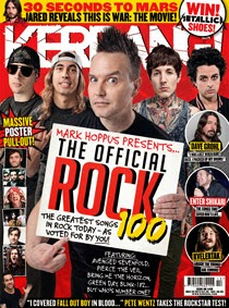
This magazine front cover challenges the generic conventions of a music magazine as it tries to follow the generic conventions but does it in a unique, almost messy, way which gives the effect that it is going against these generic conventions. For example, it has a main image with text over it giving an indication as to what the main image is connoting but it is different to the common way a magazine does this because of factors such as the font, the colour scheme, the fact that it is in a white box and the positioning. The text to go with a main image is usually further down than it is on this magazine, as seen on the 2 magazine front covers below this one. It has bright colours with a colour scheme of red, blue, yellow, white and black which for a professional magazine is a lot and is another reason why it looks messy. They are also colours that do not really 'go' together. This indicates the type of audience this magazine is aimed at: people who generally do not follow the rules or expectations and do not worry about pleasing anyone. Blue is the colour used to represent boys when you are a child which is another factor that adds to this front cover being less mature.
It has a large number of teasers which are mainly just the names of bands that are featured in the magazine (a generic convention for a music magazine) which, like Kerrang!, indicates that they need to try hard to attract an audience and use a lot of bands to draw in a wide variety of an audience. This is obvious as if you are educated in this genre and know a lot of these bands you will know that some of these bands are in a different sub-genre of rock to others, for instance, some are more classed as metal whilst some are classed as pop-rock which each have different fanbases which means by including as many as they can, Rocksound will gain more readers than if they just appealed to one fanbase as this would mean that Rocksound only have a niche audience. However, even though Rocksound has tried to broaden its target audience, it does still have a niche audience because this magazine is only aimed at people who like a certain style/genre of music, one that is not a mainstream genre.
The main colour used on this front cover is red which is a colour that has connotations connected to it such as anger, danger and passion. These words describe the target audience as they are stereotypically going to be males and males stereotypically enjoy danger and rebellion. The connotation of red links to the target audience of this magazine as they are stereotypically likely to be passionate about music (as if they weren't, they would not be buying a magazine entirely about music). These connotations link to Hedbridge's theory (1988) that youth are portrayed as being fun and trouble which is brought out in the use of red on this front cover and the connotations that surround this colour such as danger, trouble and rebellion. (Young people find fun in danger, trouble and rebellion). A convention that adds to the sense of danger, excitement and rebellion on this front cover is that every piece of text is in capital letters, as if it is shouting at the audience. Even though the masthead is in capital letters and is quite a bold and bright white, it does not stand out as much as it could do which means it runs the risk of not being noticed by the target audience when it is on the shelf and as the masthead is quite long, not all of it will be seen as 3 quarters of it is likely to be covered up by another magazine, this is why it is important for mastheads to be recognisable from the 'sweet spot' of the magazine which is an 1/8th of the top left hand corner of the front cover as this is all of the masthead that is likely to be seen because the rest will be covered up by either another magazine or the main image (like the main image on this magazine is covering up the 'O' in Rock Sound).
As far as target audience goes the audience of Rocksound is likely to be around the same as Kerrang! at 14-24. I think the low target audience age is because of factors such as the colour scheme being bright colours and therefore not very 'classy' and mature, the font being slightly unprofessional and childish and because of the way it is set out. If you compare this to NME, a magazine that has a higher target audience, you will see different conventions such as the fact this magazine is much busier than NME and as I mentioned before, the colour scheme. Another convention that suggests to me that the target audience is younger than that of NME is that there is a teaser at the top of the cover advertising the fact there are free posters inside. A fully grown adult would not want posters and would have nowhere to put them as by this age they stereotypically would have matured fully therefore would not want to put messy bits of paper on their bedroom walls. The typography choices also indicate a younger audience as the font used for almost every bit of text on this cover is not a mature font that is likely to be found on Vogue or GQ.
The gender that this magazine is likely to be aimed at is males. This is because it is a stereotype that men like rock music and that it is too 'heavy' for females. Another reason that I think this is because all of the people in the main image of this front cover are males and therefore may make females think that this magazine is not for them as there is no female on the front cover that they can relate to and aspire to be. However this could also suggest that women may look at this front cover and be attracted to the males therefore buying the magazine to find out more about them. This relates to Eva Maria-Jacobsson's (1999) theory of The Female Gaze, a theory opposite to Laura Mulvey's theory of The Male Gaze. Eva's theory states that women can sexually objectify males in the same way that males do to women, quoting that "women would be objectifying the man to a subject of their desires and pleasures of looking". However, as the males have not been sexualised in any way in terms of the clothing they are wearing and the poses they are doing, this suggests that the editors of this magazine did not create this cover with the intent of attracting females.
The social grade that this magazine is likely to appeal to is Grades C1 to E (anywhere between lower middle class to students and members of the public who are unemployed). My reasoning for this is because of the denotations on the front cover such as the names of bands (Dad Punchers, Bullet For My Valentine etc, which suggest violence and rebellion, something that members of socials grades B-A would not be interested in and stereotypically are likely to disagree with), words used in the teasers such as 'off the hook' and also the way that the band in the main image are dressed and presented (they are wearing fairly scruffy clothes with fairly scruffy hair and facial hair).
The way the people in the main image look is likely to be how the target audience look, or aspire to look. This means that the audience will be more attracted to the cover and will want to buy it to either find out how they can look like the people on this cover or just to read about them because they are interested in them as they look alike. If the target audience already look like this, this may mean that they are already a fan of this band and this genre of music which may also mean that they are regular readers of Rocksound or are buying it to find out about more bands and news about this genre.

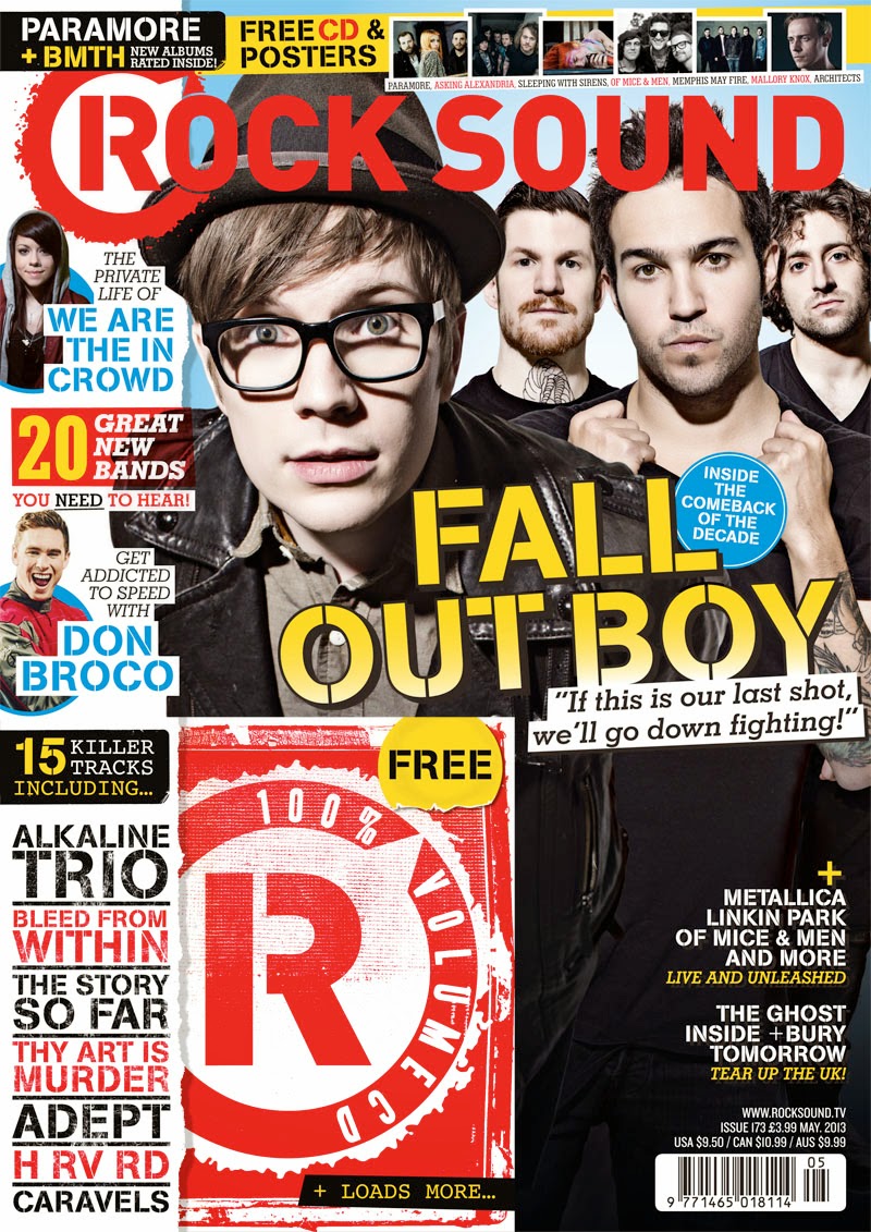
This magazine front cover is somewhat similar to the previous one I analysed as it follows the same conventions and even has the same colour scheme of red, yellow, blue, white and black. These colours have connotations surrounding them such as danger, rebellion and anger for red, connotations that are associated with people that listen to loud rock music as well as young people (this relates to Hedbridge's theory that young people are fun and trouble, and also Stanley Hall's storm and stress theory (1904) that states young people go through a degree of emotional and behavioural upheavel and if they do not get excitement, they will seek it through violence and rebellion) and the connotation of childhood for blue (as this is the colour associated with boys when you are a child). Also, the colour black is stereotypically said to be the favourite colour of rock listeners so it is important that this colour is used on the front cover of a rock magazine in order to draw the correct target audience in.
It has teasers which are more in depth than the previous magazine (it gives you an idea of what is in the magazine instead of just mentioning bands that are featured like Rocksound). It has a different kind of teaser that is unique, it includes a free gift which is not a common convention of a music magazine, more a common convention of a young girls magazine. This is a feature that hints that the target audience is likely to be young.
The text used on this magazine represents how the magazine want the audience to portray it for instance, "Your new favourite band take on the world!". This means that they want people to instantly like the main feature band and assume that the readers definitely will like them. Other conventions that portray the way this magazine will be perceived is the way it is set out. For example, this one looks more childish than NME below because it is too busy. The fact it is too busy also shows that they have to add teasers (they use a lot of band names and images) to the cover to draw and attract an audience in, also something NME does not have to do.
Another convention that supports my thoughts on it looking childish is the colour scheme of red, yellow, white, black and blue. The fact there is a lot of colours used also makes it look messy and suggests that the target audience is for a younger audience than NME, but around the same as Rocksound.
The main image is not threatening or dark (in colour and tone/mood) which is also something that suggests to me that the target audience is from about 12-24. It also shows that this is the tone of the band and that the music they produce does not have really dark lyrics and are not in the metal genre etc. This actually goes against the common conventions of Kerrang! as they usually have main images that portray rebellion and disobedience which this image does not. Another way I can tell that the target audience is a fairly young one is because there is a big teaser of a free gift included with the magazine of stickers. Like I said with Rocksound and the posters, a fully grown adult of 30+ would stereotypically not want stickers and would not have anywhere to put them whereas a younger audience would have places to put them such as school diaries, phones, bedroom walls etc.
The social grade of the target audience of Kerrang! is likely to be C1-E like Rocksound, this is anywhere between lower middle class to students and the unemployed. This is because there are conventions on this cover that would stereotypically not appeal to higher classes such as B-A. These conventions include the free gifts of stickers and posters, the scruffy, un-shaven looks of the people in the main image, the bright colour scheme and also the low price (£2.20) as higher social grades will earn more money and therefore have a higher disposable income to spend on luxuries such as magazines so they will see the price of this as low and automatically assume that it is not aimed at them, but the lower social grades who have less money to spend on luxuries.
It is obvious by looking at the names of the bands on this front cover that the editors have tried to make the target audience and broad as they can because they have included older band such as Motley Crue (this is likely to be in an effort to try and make the magazine appeal to an older audience) and much newer bands such as Twin Atlantic who is the band in the main image. It is likely that the band in the main image is found appealing by younger audiences as the band members themselves do not look very old so they will be seen as relatable by the young audiences of Kerrang!.
The target audience for this magazine is likely to be primarily males because of conventions such as the colours used (very stereotypically boyish colours), the terminology used (such as words like 'bro-down' with the word 'bro' meaning brother and the band name 'smashing pumpkins' which is violent and stereotypically girls do not condone or enjoy violence, whereas men do) and the fact that every person featured in the main image is also a male and therefore the male target audience is likely to find them relatable whereas girls would not as they are a different gender.
The masthead 'Kerrang!' instantly gives the reader a clue as to what genre this magazine is as this word connotes the typical sound that an electric guitar makes. Also, the use of an exclamation mark shows that it is a noise that is loud, which an electric guitar is and also it adds excitement (something that Stanley Hall (1904) stated teenagers crave). The editors of this magazine have also added to the effect of this use of onomatopoeia by the tagline being "Life is loud". This masthead and tagline reflects the target audience as if they are reading this magazine, they must enjoy rock music which is generally quite loud and reckless. This also links to rock concerts as they are generally extremely loud at around 115 decibels and are stated to be able to cause hearing loss (something a lot of teens suffer after coming out of a rock concert). The masthead of this magazine is in a full, bold font and colour as well as being in a position where it can be seen fully without any teasers or images covering any of it up. This increases its chances at being spotted when it is on the shelf, particularly as the sweet spot (1/8th of masthead in the top left hand corner) is on full show which means even if it is covered up, it will be seen by the audience when on the shelf in a shop.
When looking at this front cover it is obvious that there is a lot more content on the left hand side of the magazine rather than the right. This is also so that even if most of the cover is covered up by other magazines, there will still be teasers on show (and arguably the teasers that are most likely to draw an audience in) that will draw an audience in. The words "your new favourite band take on the world!" adds a touch of personalisation because it is as if the magazine is talking directly at the reader which will make the reader feel more involved and accepted by the magazine, making the reader more likely to by it.

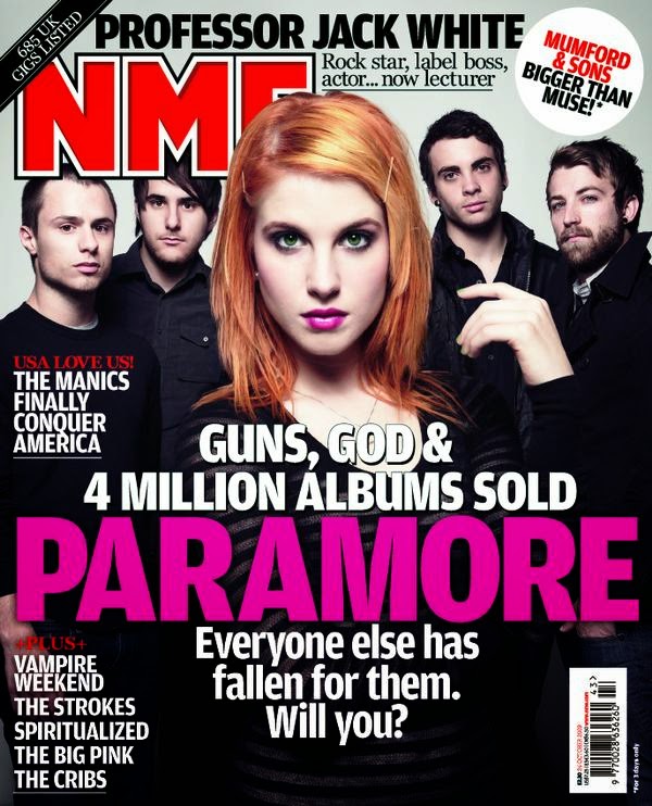
This magazine is completely different to the others I have analysed as it does not have a lot of text, has a very simple design/layout and only one image which is the main image that features only one person. The masthead is slightly hidden by the main image and isn't the most bold piece of text on the magazine, this is not a common convention of a magazine but it does make it unique. It is a simple design which hints that it is aimed at older male as they are focused more on what is inside and are likely to buy it on a regular basis so do not need persuading to buy it.
The main text of this cover suggests that the audience are educated in the genre of this magazine. The main reason I can tell this is because of the "Billie Joe" piece of text over the main image. This suggests that you know who Billie Joe is and therefore are educated which makes the reader feel good about themselves. Another thing that is suggested by the text is the masthead. The font that says NME is slightly hidden by the main image which shows that the masthead is not important and people looking at the magazine will know what it says without seeing all the letters, this is because it is a well known magazine that has regular readers. Also, there is only one image on this magazine which indicates the same thing as the masthead, that they do not need teasers because they are a well known magazine and do not need to attract their audience because they already have a regular audience and do not really need to reel new ones in.
The masthead of this magazine is a perfect example of a magazine using the 'sweet spot'. This is the area in the top left had corner that is usually all that can be seen of the magazine because of other magazines covering the rest. It is important for front covers to give a strong indication as to what the magazine is in the sweet spot to make it easier to be noticed when on a shop shelf.
The colour scheme of this cover ever so slightly challenges the target audience as it uses bright colours of red, blue and white. However the way it differs from Kerrang! and Rocksound is that these colours are slightly faded and look more vintage rather than just being slapped on the page. The colour red represents anger, passion and blood. All things that are also supported by the connotations of the main image, for instance the pose he is making and the colour clothing he is wearing. You can also see a couple of tattoos that are one of the most powerful representations of rebellion and danger, implying that even though the background is an almost baby blue which if left alone could completely change the magazines image and even possibly change their target audience, it still has an element of fiest and danger. This could also be a direct link to the personas of the target audience that I would image to be older males from the ages of about 30+ who are nearing the end of their prime and are entering fully into parenthood so do not have time to go to rock concerts and do the rebellious things they did when they were younger which is the reasoning for the childish blue background (as young people would see this blue and think that they do not want to be related to anything remotely childish as they are in the midst of leaving their childhood behind and are eager to grow up but fully grown adults would not think this way as they are obviously adults and do not need to prove it), which is also what could be the persona of the person in the main image as he is around this age.
The target audience of NME is likely to be in a higher social grade than the audiences of Kerrang! and Rocksound, because NME is aimed at an older audience so are likely to have fairly good jobs. For this reason, the social grades of the target audience is likely to be B-A (middle class to upper middle class). However, because of the tattoos on the person in the main image, this may also appeal to people in social grade C1 (lower middle class). I stated earlier that the target audience is primarily males and this because stereotypically, rock is the genre enjoyed by mainly males because it is loud and violent, connotations that are never associated with women and also as the person in the main image is a male and there is no mention of any females which mean women can not relate to this cover, but males can, making men more likely to buy it than women. However, as there is a male on the front this could indicate that women may buy this because of the males sex appeal. This links to Eva Maria-Jacobsson's theory (1999) of the female gaze and that women are also capable of sexualising males (this is the opposite to Laura Mulvey's theory of the male gaze in which Laura states that men only look at women to sexualise them).
Another way this magazine makes sure they are not portrayed as being a softer magazine, which they are at risk of because of the amount of blue there is (a colour that is not linked to danger, feist and rebellion) is by the text "my lyrics come from a really dark place" that is a quote that the person in the main image has said, most likely in the interview in the main feature article inside the magazine. This means that this article is most likely not for the faint-hearted as it contains information about when Billie Joe (the person in the main image) was in a dark place and is likely to include details that some readers may find distressing. By adding this teaser on to the front cover, it is likely to attract a wider range of audience as this may appeal to people who feel they have gone through or are going through a similar thing as Billie Joe went through when he wrote these dark lyrics and want to read how he got through it. Putting Billie Joe on the front cover means that this magazine is likely to draw in a wider audience anyway because he is a member of a very well known band, Green Day, who have hundreds of thousands of fans in the UK meaning they are likely to buy this magazine just because he is on the cover. The pose the person in the main image is doing is the typical expression you do when you are in distress or you are angry. This links to the main teaser of "My lyrics come from a really dark place".
Wednesday, 6 February 2013
Music Magazine History, Genre Choice And Audience
People consume music magazines for a number of reasons which according to Blumer and Katz are entertainment, information and socialisation. It is an easy way to find out new information about a certain genre of music and to find out about new music. The general primary target audience for music magazines are aged 12 - 25. Music magazines help the success of bands as it boosts the amount of people who know about them, reviews their songs/albums (if it gets a good review people are likely to go out and buy it/download it however if they get a bad review this will affect their success).
My Music Usage in the Last Month
My Music Usage in the Last Month
Phone
YouTube
Radio
TV
Laptop
Films/Cinema
List music you have paid
for and how much it cost
CD £10
CD from iTunes £5
iTunes various songs for 99p
CD for a present £10
Cool bands:
All Time Low
You Me At Six
The Maine
Uncool bands:
JLS
The History of Music
ERA
|
TECHNOLOGY
|
AUDIENCE
|
Cavemen
|
Singing, clapping, hitting things
|
Other cavemen
|
Civilisation
|
Musical instruments built
|
Small groups
|
Composers
|
Collection of instruments
|
Larger audiences
|
Recorded wax cylinders
|
Phonographic equipment
|
Family/friends
|
Record (Vinyl)
|
Record player
|
Family/friends
|
Radio
|
Radio broadcast/Radio owned
|
People near the transmitter
|
Sheet music
|
Musical instruments
|
Musical people
|
Cassette
|
Tape players
|
Recording studio/homes
|
CD
|
CD Walkman
|
Best quality ever
|
Mini disc
|
Half digital half analogue
|
No one bought them – audience refused
|
Internet/mp3
|
Need: PC, Internet access, Player, Headphones
|
The world, all music that has ever been made
Headphones: You listen on your own
|
How do you find out about
a new band? - The Pre Digital Age (Pre 2000)
Radio One
Top Of The Pops
NME/Sounds/Melody maker
Your friends
How do you find out about
a new band? - Digital Age (2000 onwards)
Internet - Twitter, magazine websites, Spotify, YouTube
Television programs (by playing music in the background of tv shows, adverts, adverts for albums etc)
Television programs (by playing music in the background of tv shows, adverts, adverts for albums etc)
My Genre Choice
The genre I have chosen to base my magazine on is Rock. This means I will have to include the common conventions of a Rock magazine and make sure it is targeted to the appropriate audience. I chose this genre because it is one I am fond of and therefore know quite a lot about, making it easy to create a magazine based on this genre because I will know bands of the genre and information about the genre to include in the magazine and also as I read quite a lot of magazines that focus on the rock genre meaning that I know and understand generic conventions of these magazines.
Popular magazines in this genre include:
Kerrang! Rocksound NME
History of Rock
The genre of rock has been popular since it originated as 'rock 'n' roll' in America in the 1950's. It later developed into different variations in the 1960's onwards. Rock generally includes bands of around 4 people each playing their own instrument such as an electric guitar, electric bass, drums and vocals (the lead singer is also likely to play an electric guitar). In the late 1960's the sub-genre classic rock was formed which lead to the creation of new classic rock bands (includes bands such as Motley Crue, Led Zeppelin, ACDC, and Rolling Stones) and new formations of sub-genres over the next 20 years, such as rap metal, heavy metal, punk rock and alternative rock. Punk caused a global controversy in the 1980's because of the popularization of bands such as the Sex Pistols who encouraged rebellion and anarchy, taking its tole on the teens of Britain changing their behaviour and causing them to rebel against social norms. The 1990's was a decade where the most popular sub-genre of rock was grunge and indie rock because of the massive domination that Nirvana had on the music industry. The 2000's saw the rise of 'emo-rock' which was a completely new genre that was popular amongst the teenage population and caused them to change the way their dress, look and act to match the personas of members of emo bands.
The genre of rock has been popular since it originated as 'rock 'n' roll' in America in the 1950's. It later developed into different variations in the 1960's onwards. Rock generally includes bands of around 4 people each playing their own instrument such as an electric guitar, electric bass, drums and vocals (the lead singer is also likely to play an electric guitar). In the late 1960's the sub-genre classic rock was formed which lead to the creation of new classic rock bands (includes bands such as Motley Crue, Led Zeppelin, ACDC, and Rolling Stones) and new formations of sub-genres over the next 20 years, such as rap metal, heavy metal, punk rock and alternative rock. Punk caused a global controversy in the 1980's because of the popularization of bands such as the Sex Pistols who encouraged rebellion and anarchy, taking its tole on the teens of Britain changing their behaviour and causing them to rebel against social norms. The 1990's was a decade where the most popular sub-genre of rock was grunge and indie rock because of the massive domination that Nirvana had on the music industry. The 2000's saw the rise of 'emo-rock' which was a completely new genre that was popular amongst the teenage population and caused them to change the way their dress, look and act to match the personas of members of emo bands.
Subscribe to:
Posts (Atom)