I chose this website as this is an excellent example of a regional website and it also represents the style of website I want to create. As my chosen genre is regional but also mixed with the fashion this website will be an example of the regional side.
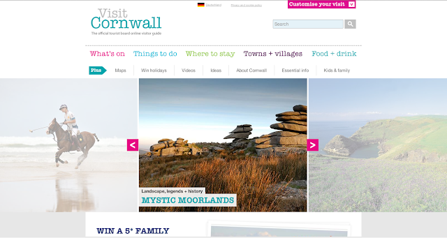
Home page -
Linked page #1 -


Home page -

Just by looking at this website I can tell exactly what tone they are trying to portray about Cornwall, this it is a modern, attractive and exciting county. This however is not the reality but these 3 images would have you believe it is. The first image, which is of someone playing polo on a seemingly empty beach, portrays the idea that Cornish people have a disposable income so have enough money to spend on luxury items such as horses. This could also be their own private beach as there is no other people on it. It appears to put Cornish people into an elite group as Prince William and Prince Harry famously enjoy a game of polo; this suggests that Cornish people are of the same level as royalty and that they are just as wealthy and 'posh'. All 3 images follow the idea of Cornwall's landscapes being empty and completely untouched by the human race. It gives the audience the idea that everywhere in this county is very private and magical, completely different from cities upcountry where most of the holiday makers will come from. The reason this website uses images like this and not the reality of Cornwall is because it costs a lot to come on holiday here and people would not visit if they knew the reality. Another reason images of the reality are not used is because Cornwall has connotations such as 'mystical' and 'tranquil' surrounding it and these illusions would be shattered if the reality was revealed. This leads me to the layout. The way the header and body are laid out on this web page is stylish, creative and modern, which also happen to be words used to describe the up and coming parts of Cornwall.

The largest piece of text on this page is in the top left corner and reads 'Visit Cornwall' which is the name of the website but is also the exact aim of this website summed up in 2 words. Everything on this website is all to convince people to come to Cornwall. Each page of the website has the same logo in the same place and is the same size. This is a feature that is different from the Vogue website which supports my idea that Vogue do not need to convince and persuade people to read the magazine and visit the website etc as they know they will always have an audience and they are not bothered about drawing in a new audience because they simply do not need it. This is different from the Visit Cornwall website as this website does want a bigger audience and care very much about it, so much so that this whole website is dedicated to this very aim (whereas Vogue's websites aim is to inform and almost 'boast' about how much they know and how much power they have to make things 'cool').
The colour scheme used on this home page is quite broad as there is 9 or 10 different colours used. This matches the connotations that surround a family holiday as usually there are a lot of people going which matches the theme of a lot of colours used on this page. Another connotation is excitement which can be seen on this page in the form of a lot of colours in the colour scheme, for instance if the colour scheme was black and white (like Vogue) this would not suggest excitement but instead suggests the opposite. Another reason for the colour scheme is that this website does not have a sole target audience but is just targeted to most ages, both genders and every type of personality as holidays are something everyone does. Every detail on this website is created in a way that it appeals to almost everybody. Another aspect that suggests this website has been designed to appeal to every age and every personality is the size and font of the text. Stereotypically older people (and any ages that just simply have poor eyesight) will need larger text to be able to read it so in order for this page to accommodate these people, they must have large text. They must also make sure they choose a font that is easy to read and see.
The largest text on this page is likely to be the name of the website, however this is about the same size as the name of the feature that is being advertised on the page. This suggests that the website are not overly bothered about whether you are completely aware of the name of website as it is the content that is important. The reason they are not bothered whether the audience know the name of this website is because they are not a company who will gain money from their audience as their main aim is to attract visitors to Cornwall therefore meaning that the county will gain money, so the important factor of the website is making sure the audience is aware that this website is about Cornwall. This is noticed in the title as the word 'Cornwall' is bigger than the word 'Visit'.

This is the reality of Cornwall in the summer; very busy and crowded.
The colour scheme used on this home page is quite broad as there is 9 or 10 different colours used. This matches the connotations that surround a family holiday as usually there are a lot of people going which matches the theme of a lot of colours used on this page. Another connotation is excitement which can be seen on this page in the form of a lot of colours in the colour scheme, for instance if the colour scheme was black and white (like Vogue) this would not suggest excitement but instead suggests the opposite. Another reason for the colour scheme is that this website does not have a sole target audience but is just targeted to most ages, both genders and every type of personality as holidays are something everyone does. Every detail on this website is created in a way that it appeals to almost everybody. Another aspect that suggests this website has been designed to appeal to every age and every personality is the size and font of the text. Stereotypically older people (and any ages that just simply have poor eyesight) will need larger text to be able to read it so in order for this page to accommodate these people, they must have large text. They must also make sure they choose a font that is easy to read and see.
The largest text on this page is likely to be the name of the website, however this is about the same size as the name of the feature that is being advertised on the page. This suggests that the website are not overly bothered about whether you are completely aware of the name of website as it is the content that is important. The reason they are not bothered whether the audience know the name of this website is because they are not a company who will gain money from their audience as their main aim is to attract visitors to Cornwall therefore meaning that the county will gain money, so the important factor of the website is making sure the audience is aware that this website is about Cornwall. This is noticed in the title as the word 'Cornwall' is bigger than the word 'Visit'.
Linked page #1 -

This is my first linked page from Visit Cornwall. There is an obvious difference in layout of the body on this page than the home page which helps to differentiate between the content shown on each and the aim of each page (the aim of this page is to inform the reader on what is going on in Cornwall, whereas the aim of the homepage is to introduce the website and tell the reader a bit about what is on each page of it, they do this by using teasers which are supposed to intrigue the reader enough so that they read the whole article). The header is the same which adds a sense of 'safety' and familiarity which means it is quick and simple to navigate the site no matter which page the audience is on. This suggests the target audience is males and females (although the colour palette would suggest stereotypical that the target audience is specifically females as the text colours are very bright and especially on this page with the text being pink, a colour that is associated strongly with females) aged 30+ in the social grade C-A. This is because holidays are not cheap so in order to have one you must have a disposable income. It may also appeal to people in a lower social grade than this who have aspirations to go on a holiday to Cornwall some day when they can afford it, they may use the information and images on this website as motivation to earn enough money etc.
There is no indication whether this web page is targeted at couples, couples with children, single people, elderly people etc. which means that it will appeal to all ages and lifestyles but it is very likely to be directed at a mass audience instead of a niche audience. Another reason for it likely to appeal to all ages and lifestyles is that the page is very user-friendly so even people who have very basic computer skills will be able to use it. It is easy to see that it is a user-friendly site as there is easy to read, bold text, easy site navigation because of the simple layout and drop-down menus to refine which results show up for you and because there is a 'customize your visit' option in the top right hand corner which will make the site exactly how the audience likes it.
The main image on this page is another photograph of Cornwall in its element (which is a running theme through each page of the website) and again is to persuade the readers to come to Cornwall. It shows the sea looking blue and calm (which as shown in the image above is not often the case), the sky looking a nice shade of blue and the weather being generally tranquil and is probably warm. It also shows that the beach is very busy which suggests that this is a very popular place to come on holiday and according to this picture, there is a reason for this. It also suggests that the reader of this website is the only person to not be in Cornwall on holiday and are missing out which is a simple psychological mind trick which makes the reader subconsciously want to come here so that they are not missing out. This links in with the Hypodermic Needle Theory as this media product is manipulating the thoughts of the reader which makes them want to do what this website is telling them to do (visit Cornwall so that they do not miss out on what everybody else is doing). This image does not have anything to do with what is on this linked page which adds an air of mystery and is saying that they are not going to say anything about it as you have to come here to find out for yourself; as many people have by the looks of this image.
Linked page #2 -There is no indication whether this web page is targeted at couples, couples with children, single people, elderly people etc. which means that it will appeal to all ages and lifestyles but it is very likely to be directed at a mass audience instead of a niche audience. Another reason for it likely to appeal to all ages and lifestyles is that the page is very user-friendly so even people who have very basic computer skills will be able to use it. It is easy to see that it is a user-friendly site as there is easy to read, bold text, easy site navigation because of the simple layout and drop-down menus to refine which results show up for you and because there is a 'customize your visit' option in the top right hand corner which will make the site exactly how the audience likes it.
The main image on this page is another photograph of Cornwall in its element (which is a running theme through each page of the website) and again is to persuade the readers to come to Cornwall. It shows the sea looking blue and calm (which as shown in the image above is not often the case), the sky looking a nice shade of blue and the weather being generally tranquil and is probably warm. It also shows that the beach is very busy which suggests that this is a very popular place to come on holiday and according to this picture, there is a reason for this. It also suggests that the reader of this website is the only person to not be in Cornwall on holiday and are missing out which is a simple psychological mind trick which makes the reader subconsciously want to come here so that they are not missing out. This links in with the Hypodermic Needle Theory as this media product is manipulating the thoughts of the reader which makes them want to do what this website is telling them to do (visit Cornwall so that they do not miss out on what everybody else is doing). This image does not have anything to do with what is on this linked page which adds an air of mystery and is saying that they are not going to say anything about it as you have to come here to find out for yourself; as many people have by the looks of this image.

This page is very similar to the previous page except for the tone and content, this indicates that the site is reliable and sensible as well as trustworthy which is good as this is a website trying to attract visitors to Cornwall and if they felt like they could not trust the things that this website says about Cornwall they would not be inclined to come here. By this page the audience is likely to trust the website as they would more than likely have been on a number of other pages before this. To maintain this trust, the website has to make sure everything fits in and that the layout, typography, images etc all stay relatively similar and has no unexpected features (unlike Vogue who do not stick to sensibility and give a 'we don't care' attitude to what goes on their website, as long as they think it's cool. The tone of this page is more dark and dull as it is a page that the main audience will be less interested in whereas the 'What's on' page will be the page that the audience is most interested in. The main convention that suggests the dull tone is the colour scheme. It is obviously because the text is a dark colour but the reason for this is because the website knows this will be less viewed than the previous page so it is almost as if they did not try very hard. This is the opposite to the previous page as the text colour is the very bright colour of pink. The target audience for this page in specific is very likely to be solely adults as it does not use bright colours that will excite and entice a younger audience. The content on this page suggests the same target audience also as if a family was planning a holiday to Cornwall, the adults would be the ones to decide where to go/where to stay.
The verisimilitude of the main image on this page is strong as this is what Cornwall looks like. It has not been edited to look more appealing or exaggerated to look more like a more luxurious holiday destination such as the Caribbean. The only control of this image was that it was taking on a nice, sunny day which is when Cornwall looks its best. Something that has been slightly adapted is that this image is supposingly representing the towns and villages of Cornwall which gives the impression that a lot of towns/villages in Cornwall have views like this and have access to water when this is not strictly true. There are lots of yachts and boats featured in the main image on this page which implies that people living in and visiting Cornwall have a lot of money and live a lavish life style and suggests that this is the life you could live if you came here.
The Frankfurt School theory suggests that the media can turn anything into something people would pay money to see or own. This then makes the product untrustworthy and dishonest as the media are trying to make the product the best they possibly can so that they can gain money. This theory relates to this website as there does not absolutely need to be a website about Cornwall and something that really reinforces it is that there are a high number of websites about Cornwall, when there doesn't even need to be one. These websites do not need to exist as the information they contain can be found elsewhere such as in travel agents. As there are so many websites, they must make sure that the information they contain must be more effective and more interesting than every other website, which means that most websites will be stretching the truth as far as they can so that the audience think their website is the best one and so that the readers visit Cornwall because of this website. This includes editing images to make Cornwall look magical and exotic (something that is seen on the home page of this website by the use of the text 'mystic moorlands'). It also includes slightly twisting the truth for example, saying that Cornwall is the most luxurious place in the country and the closest you will get to going to a foreign country without actually going there.
There is more evidence of proficient research here with some excellent elements. Some focus on font choices and modes of address (how the website chooses to 'speak' to its readers.) would be beneficial. Use the 'How to progress...' Blog to give you some pointers.
ReplyDeletePlanning and research here complete and detailed and show elements of excellence and obvious proficiency when discussing these similar products and a potential audience and their response/expectations.
ReplyDelete